By Emma Bastin
Lego. Weetabix. Volvo. Tetley. Gillette. No doubt when you read these words, they immediately conjure up an image or idea of an item or product. This is precisely what the companies behind them want you to do, and the importance of brand and advertising is so important today that in 2024 £41 billion was spent on marketing in the UK alone. But whilst today we live in an age of sophisticated marketing methods backed up by research, in the interwar period the branding and advertising of goods was a relatively new concept.
The Industrial Revolution and the move to factory production was a key factor in the establishment of brands. Manufacturers needed to identify their products and show that although their goods were not made by a local producer, they were made to a high standard. Food companies were some of the first to brand items such as Cadbury’s, Lipton’s, and Fry’s. The name alone differentiated the product from its competition and suggested that it had certain values and qualities. Seeing how successfully this strategy worked, other manufacturers followed suite, and soon all manner of goods from bicycles to yarn were branded.
By the 1920s, there was a growing realisation that the name of a product was not just making the item easily identifiable for consumers, but that it could create goodwill and trade name alone could make a sale. It was in 1922 that the first record of the use “brand”, short for “branded good”, was used and along with this new word came the realisation that the product could be advertised as more than just the sum of its parts. By attaching meanings and emotions to a brand through advertising, products became more desirable and sales growth followed.
The starting point for a brand was often its packaging. Packing a good in box or wrapping showed that it was clean and unadulterated (something we take for granted today), but it also provided the perfect canvas for demonstrating the values of the company that produced it, what the product did, and made it easily identifiable. None of this was considered in detail at the time, and it was only in the late twentieth-century that the effects of packaging on the customer were studied, nevertheless, it’s clear when we look at packets from the interwar period that manufacturers were aware of the benefits of looking good on the shelves.
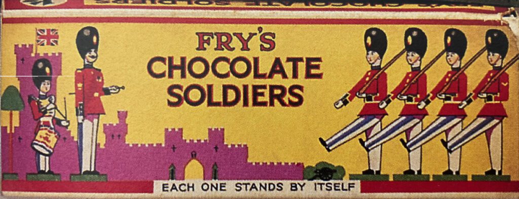
When it came to food, it tended to be the non-essentials where we see the most Art Deco style boxes and tins. Presumably this is precisely because they weren’t essential goods, and the consumer needed extra persuasion to buy them. The Fry’s chocolate soldier box below is brightly coloured and designed to appeal to boys who probably played with toy soldiers. The wrapper even tells the potential purchaser that the soldiers can stand up! It takes traditional imagery of soldiers and a British castle, but they are rendered in a simple and modern style.
Bird’s Custard was advertised heavily in women’s magazines as a quick and easy way to make a pudding. They made repeated use of the three bird motif seen on the below advert, with it appearing in a number of adverts in the mid-1930s. The chirping birds would have been instantly recognisable to consumers and it was an image and name easy to recall.
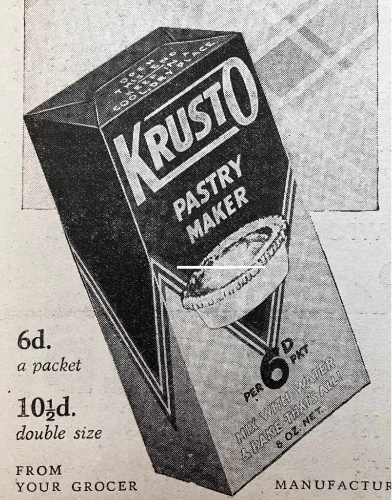
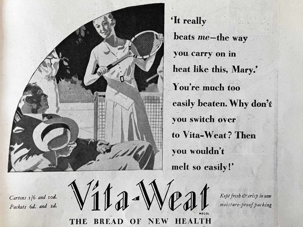
This was also the era when brand names began to be created from scratch. Whereas brands which had developed in the nineteenth century had tended to be family names, such as Rowntree’s or Colman’s, by the early twentieth century was a trend towards descriptive and onomatopoeic words: Krusto, Bisto, Vita-Weat, Aero. These cutting-edge names were recognisable and easy for consumers to pronounce. Additionally, the adverts and packaging for these products used images and text which implied the goods were modern, practical and convenient.
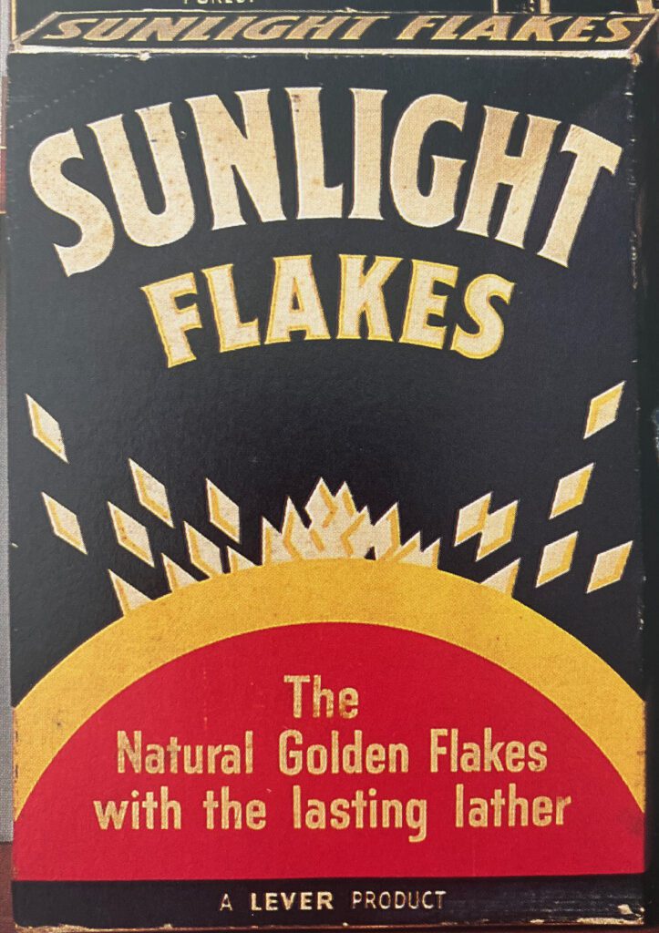
Soap packets are another place where we can see strong Art Deco influences. Lever Brothers and Pears had led the way in advertising soap in the late nineteenth century, and they had nearly forty years of experience of branding goods by the interwar period. This also forced other manufacturers to be inventive in their branding. Sunlight Soap in particular drew on modern themes for its boxes such as the one below. The stylish box below is not only eye-catching, but shows that this is a modern, easy to use product. Fairy were also keen to show how up-to-date they were: in the below image it is not the look of the box which does this, but the promotion of the “Fairy Show” on the radio. Not only was this state-of-the-art technology, but it was also hosted by the foremost British star of the day, Gracie Fields.

This article has looked at groceries and household essentials, and none of the advertising can be considered particularly ground-breaking or outstanding. However, when it came to non-essential products, be they small or large purchases, Art Deco was used in a far more striking way, and this will be looked at in June’s article, Style and Brand Consciousness (Part 2).
Emma is a historian of the early twentieth century, particularly focusing on the interwar period. She is fascinated by social, material and cultural history, and explores retail, fashion and consumerism. She completed her PhD in 2024. https://www.emmabastin.com/